
Project detail
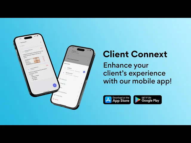
Client Connext App
A mobile app that simplifies client–accountant communication through structured questions, document sharing, and voice messaging.
Mobile App
9 months
Client Connext App - Xenett
Project Overview
Client Connext is a mobile-first communication platform designed to help accounting firms and their clients collaborate more efficiently. I worked on this project as a UI/UX Designer, focusing on simplifying how clients respond to accounting-related questions, share documents, and resolve uncategorized transactions—directly from their mobile devices.
The core idea was to replace long email threads and delayed responses with a clear, structured, and fast in-app communication experience.
My Role
UI/UX Designer
My responsibilities included:
Understanding communication gaps between accountants and clients
Designing end-to-end user flows for queries and responses
Creating wireframes and high-fidelity mobile UI
Ensuring clarity, accessibility, and ease of use
Tools Used: Figma, FigJam
Problem & Context
Accounting teams often need quick clarification from clients regarding transactions, documents, or statements. However, traditional communication channels like email and phone calls create friction:
Emails get delayed or missed
Clients find accounting terminology confusing
Sharing documents is inconsistent and unstructured
Following up on the same query wastes time
Clients needed a simple way to understand questions, respond quickly, and share required files without switching tools.
UX Approach
To address these challenges, I focused on three UX principles:
Clarity: Present questions in a clear, readable format
Speed: Enable responses in seconds, not minutes
Flexibility: Support text, voice, and file-based replies
This approach guided all design decisions.
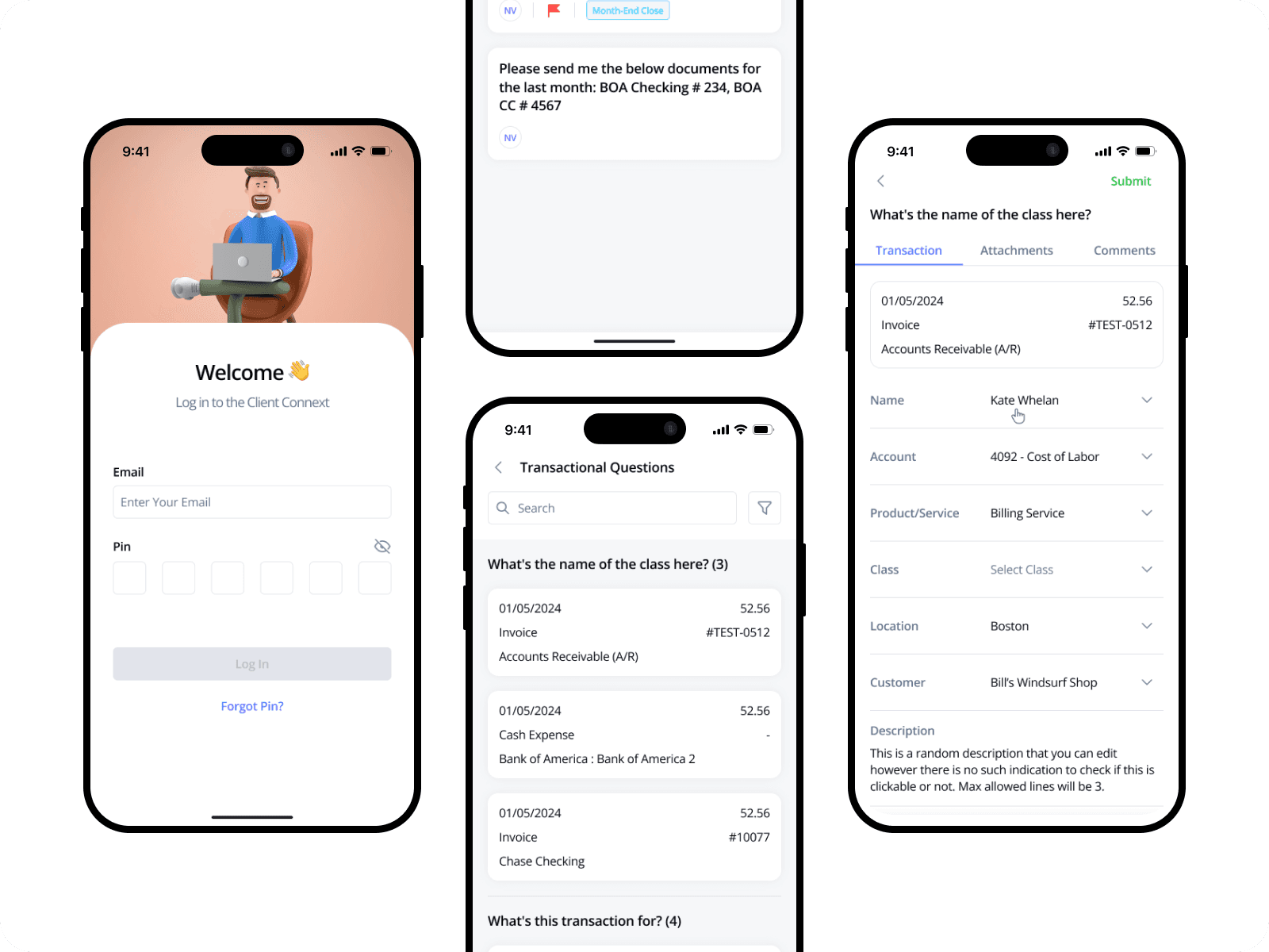
Core User Flow
Client Flow: Login → Dashboard → View questions → Open a question → Respond (Text / Voice / File) → Submit
The flow was designed to minimize steps and reduce cognitive effort for non-technical users.
Key UX Decisions
Visual Design
Clean, neutral color palette for a professional accounting feel
Card-based layout for better readability
Clear typography to handle content-heavy screens
Typography & Color Palette
A clean and professional color palette was used to maintain trust and clarity in accounting workflows
Primary colors highlight key actions, while neutral tones keep the interface calm and easy to scan
Status colors help users quickly understand success, warning, and error states
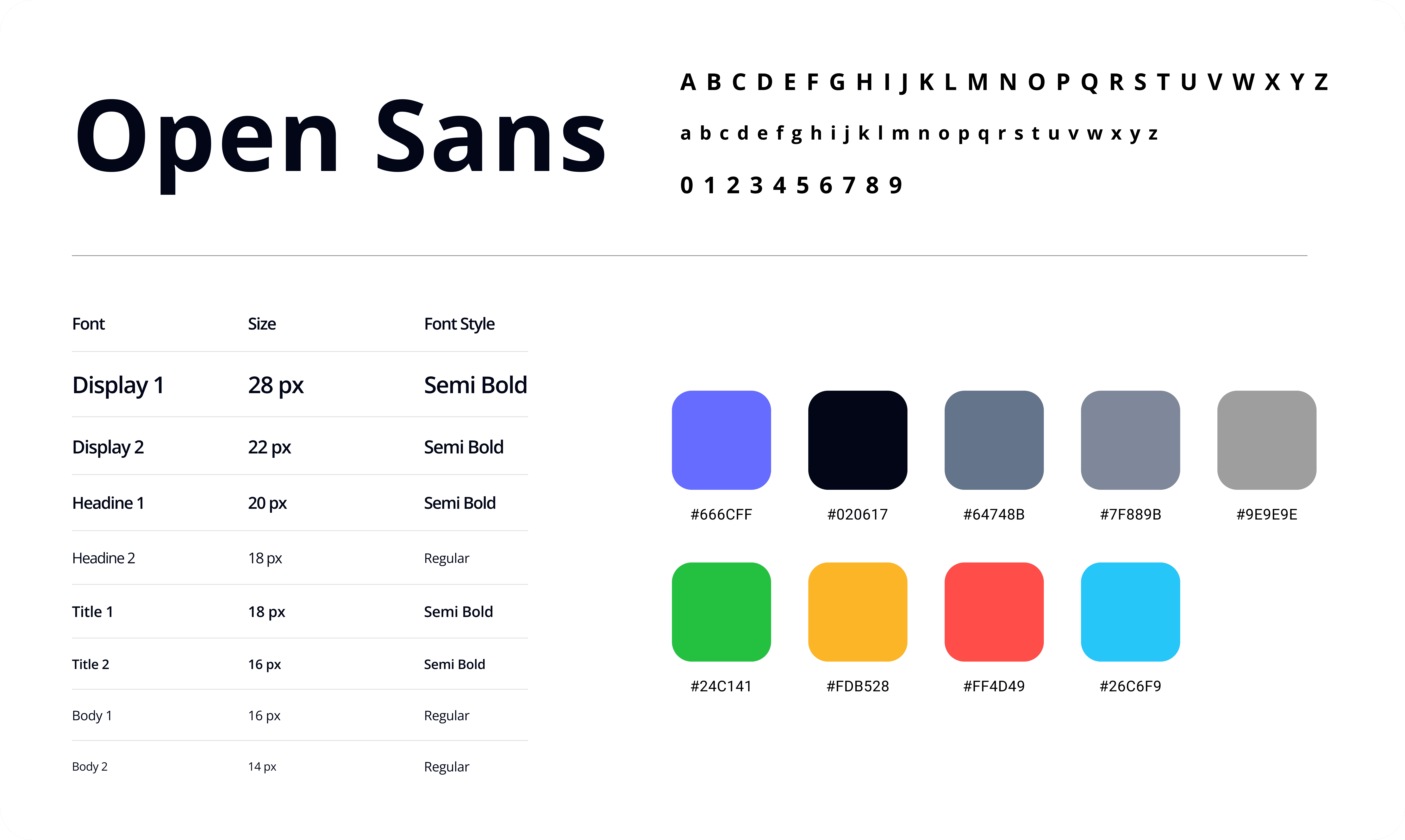
Open Sans was chosen for its high readability on mobile and web screens
A clear typography hierarchy makes questions and details easy to read for non-technical users
Icon Set & Components
A clean and consistent icon set with reusable components was designed to keep the interface simple, clear, and easy to use across accounting workflows.
Icons follow familiar patterns to reduce learning effort for non-technical users
A simple and consistent icon set was used to support actions without adding visual noise
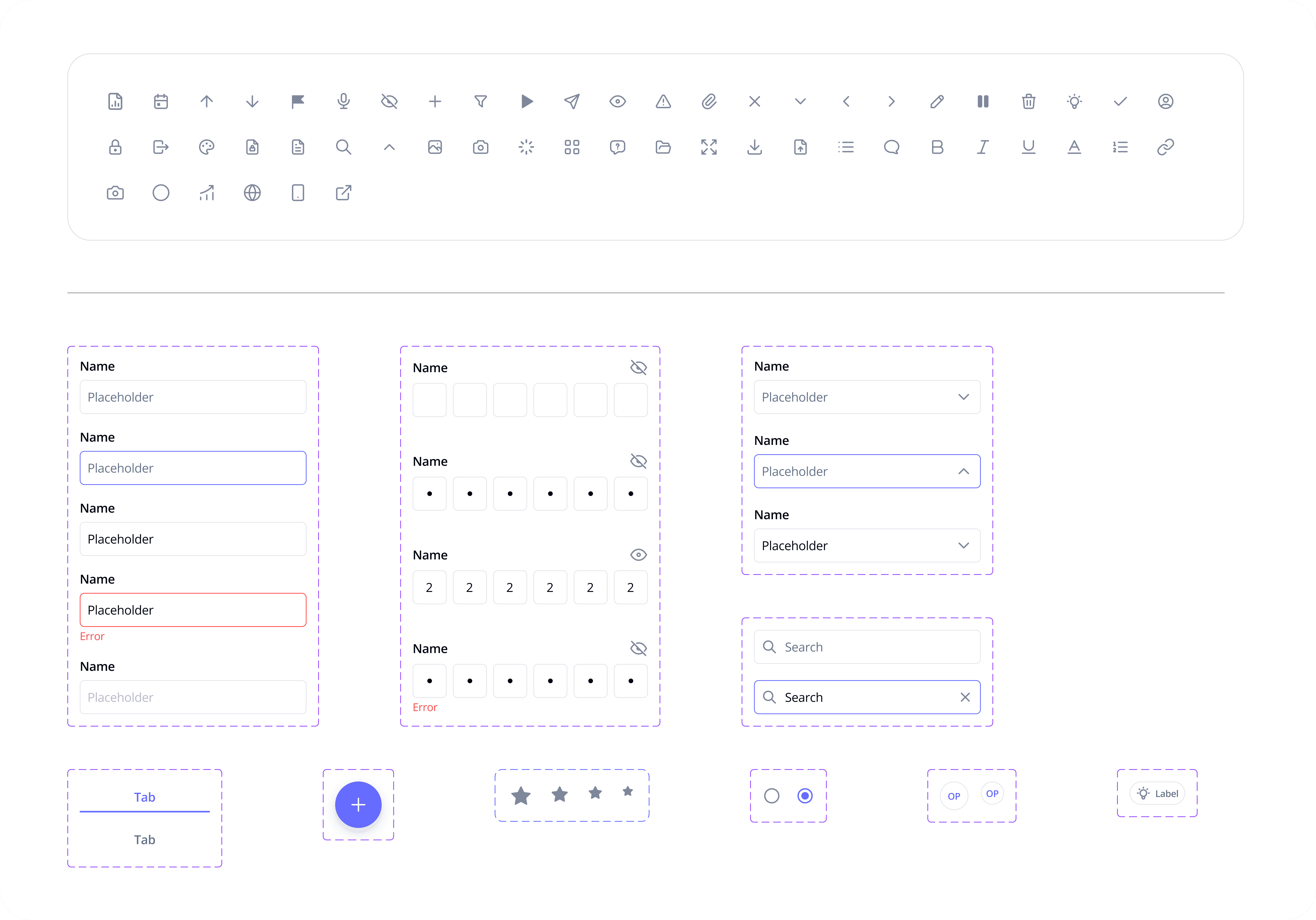
Consistent components help maintain visual uniformity across all screens
This approach improves usability and makes the product easier to scale
It also helps speed up design and development by reducing repetition and inconsistencies
End-to-End Client Interaction Flow
The client interaction flow was designed to guide users smoothly from viewing questions to submitting responses, with minimal effort and clear context at every step.
Transactional and non-transactional questions are clearly separated for quick understanding
Each question opens into a detailed view with full context and previous communication
Clients start by logging in and land on a dashboard showing pending questions
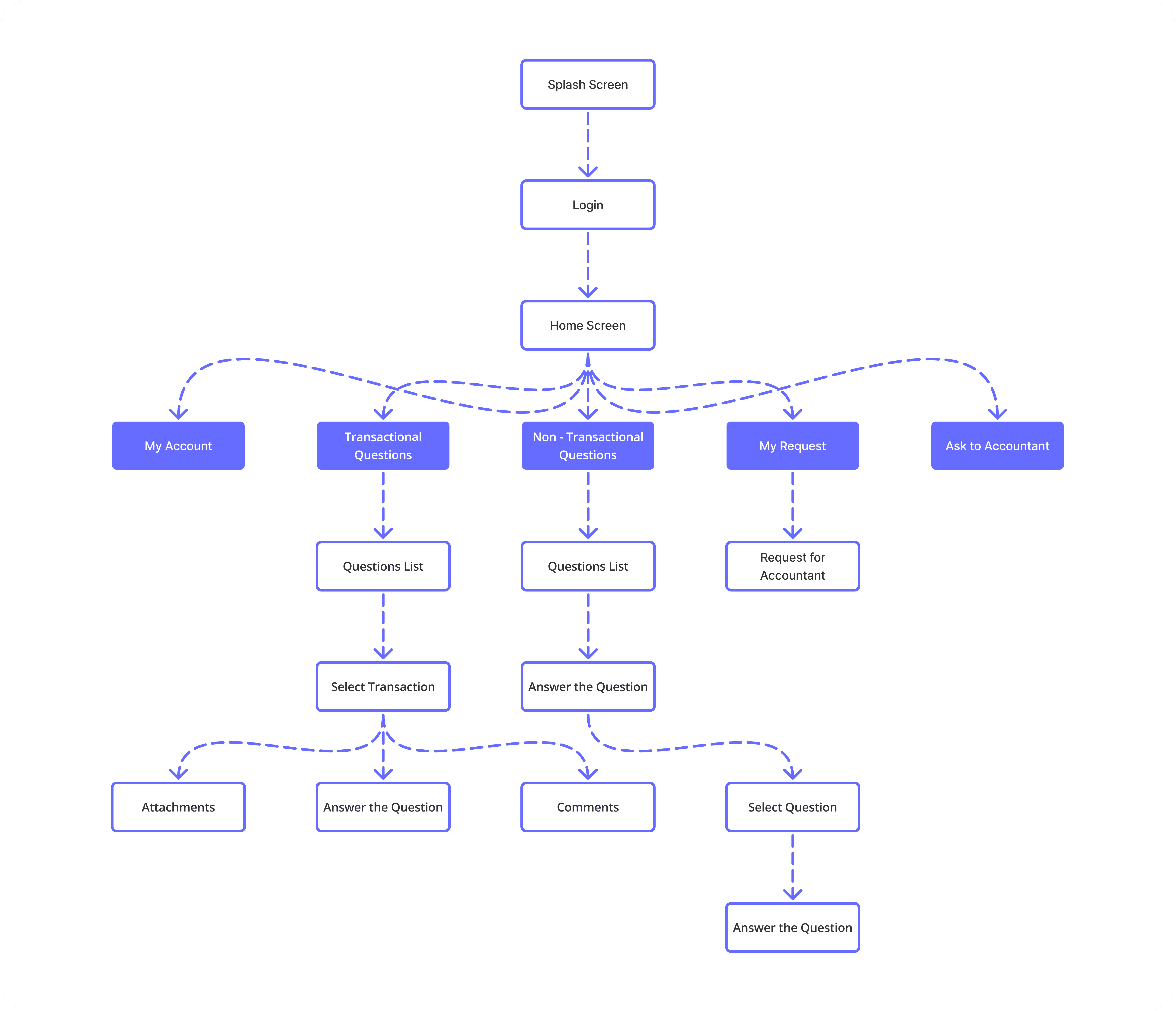
The flow minimizes steps and avoids unnecessary decisions to reduce cognitive load
This end-to-end structure helps clients complete actions quickly and confidently
Clients can respond using text, voice messages, or file attachments from the same screen
Wireframes & UX Structure
Wireframes were created to focus on structure, content hierarchy, and user flow before moving into visual design.
Key screens like dashboard, question list, and question detail were mapped first
Priority was given to clarity and ease of understanding for non-technical users
Early wireframes helped validate the end-to-end client interaction flow
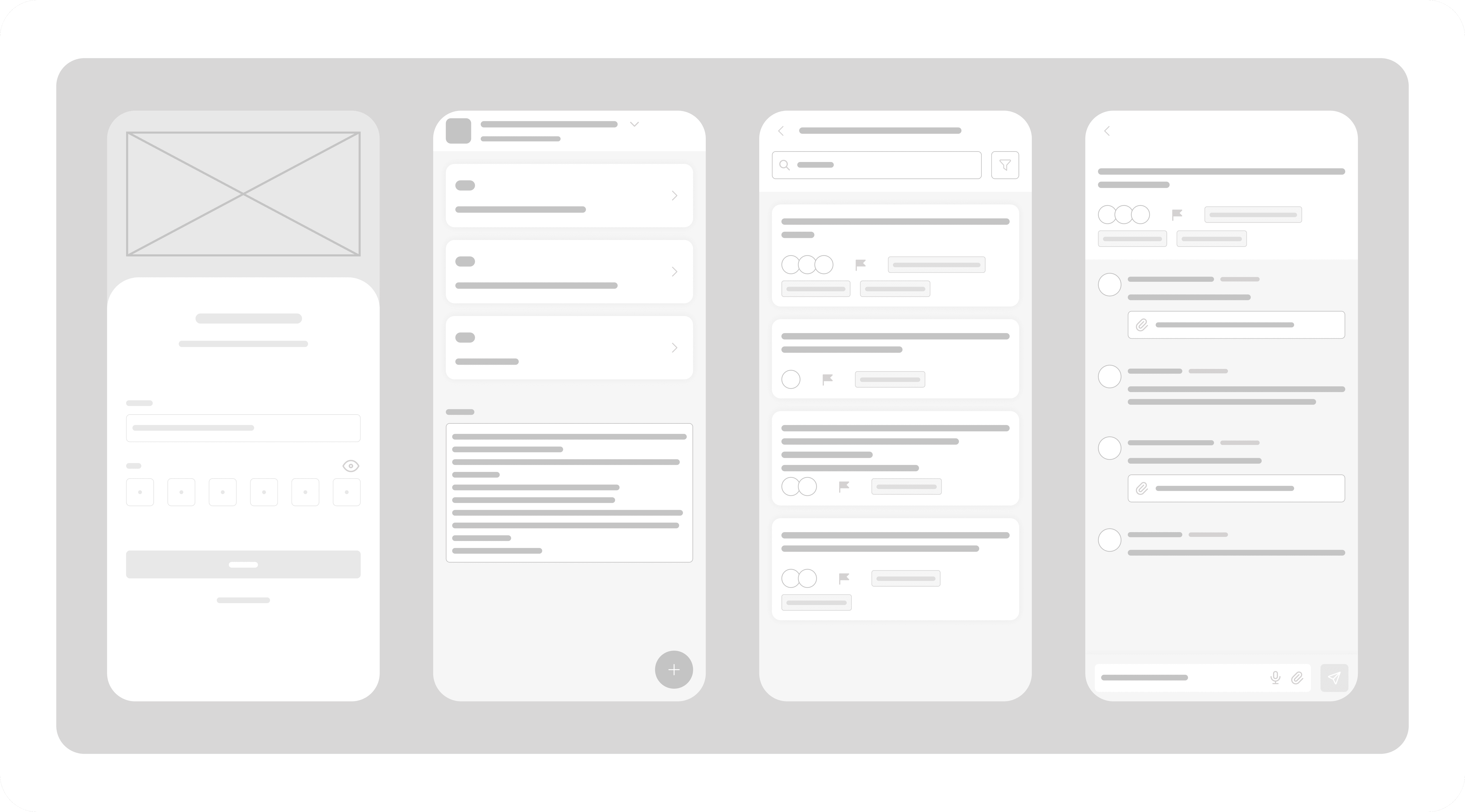
Interaction elements were kept minimal to avoid distraction
Wireframes allowed quick iteration based on usability feedback
Content placement was designed to reduce scanning and confusion
Final UI Screens (Hi-Fidelity Design)
The final UI screens bring together all UX decisions, visual direction, and interaction patterns into a clear and polished experience.
The final designs apply the defined color palette and typography consistently across all screens
Clean layouts and spacing help users focus on questions and required actions
Visual hierarchy makes it easy to scan, understand, and respond quickly
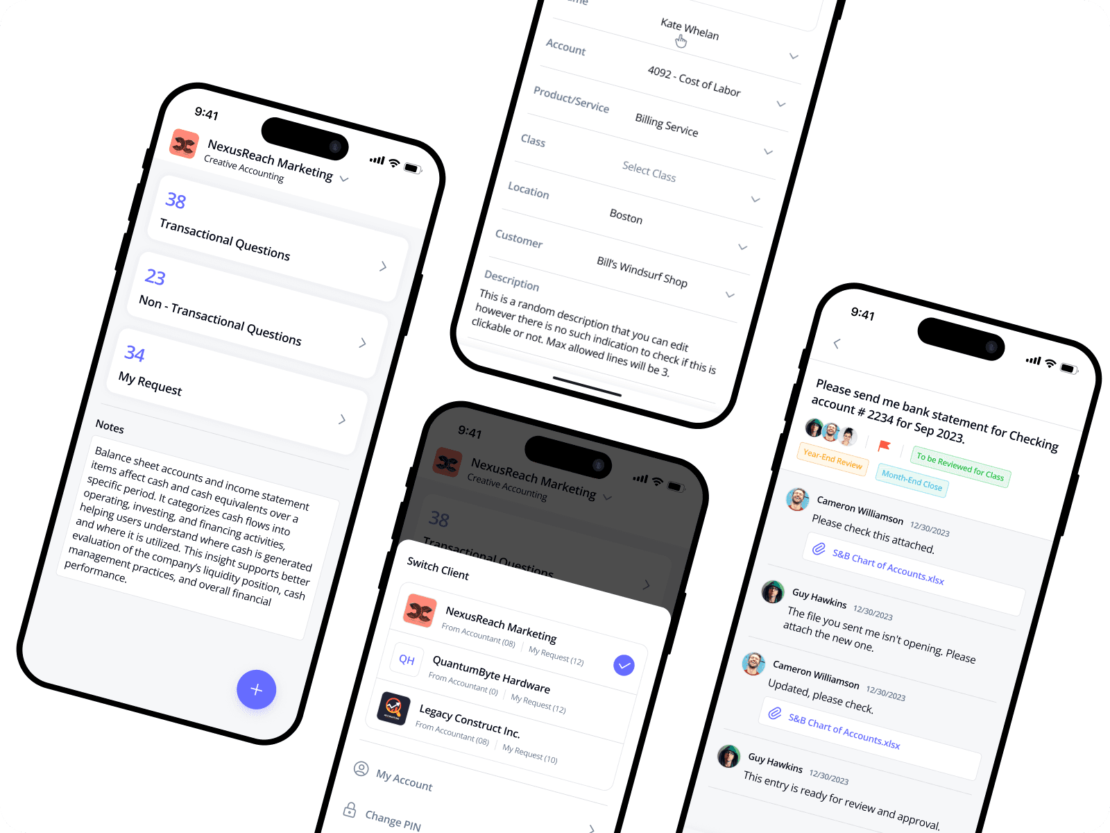
Components and icons remain consistent to maintain familiarity and usability
The interface feels calm, professional, and trustworthy for accounting workflows
These screens represent the final, production-ready experience of the product
Final UI Screens – Dark Mode
The dark mode was designed to support long usage sessions while maintaining clarity and visual comfort.
Dark color tones reduce eye strain during extended use
Primary actions and highlights remain clearly visible in low-light conditions
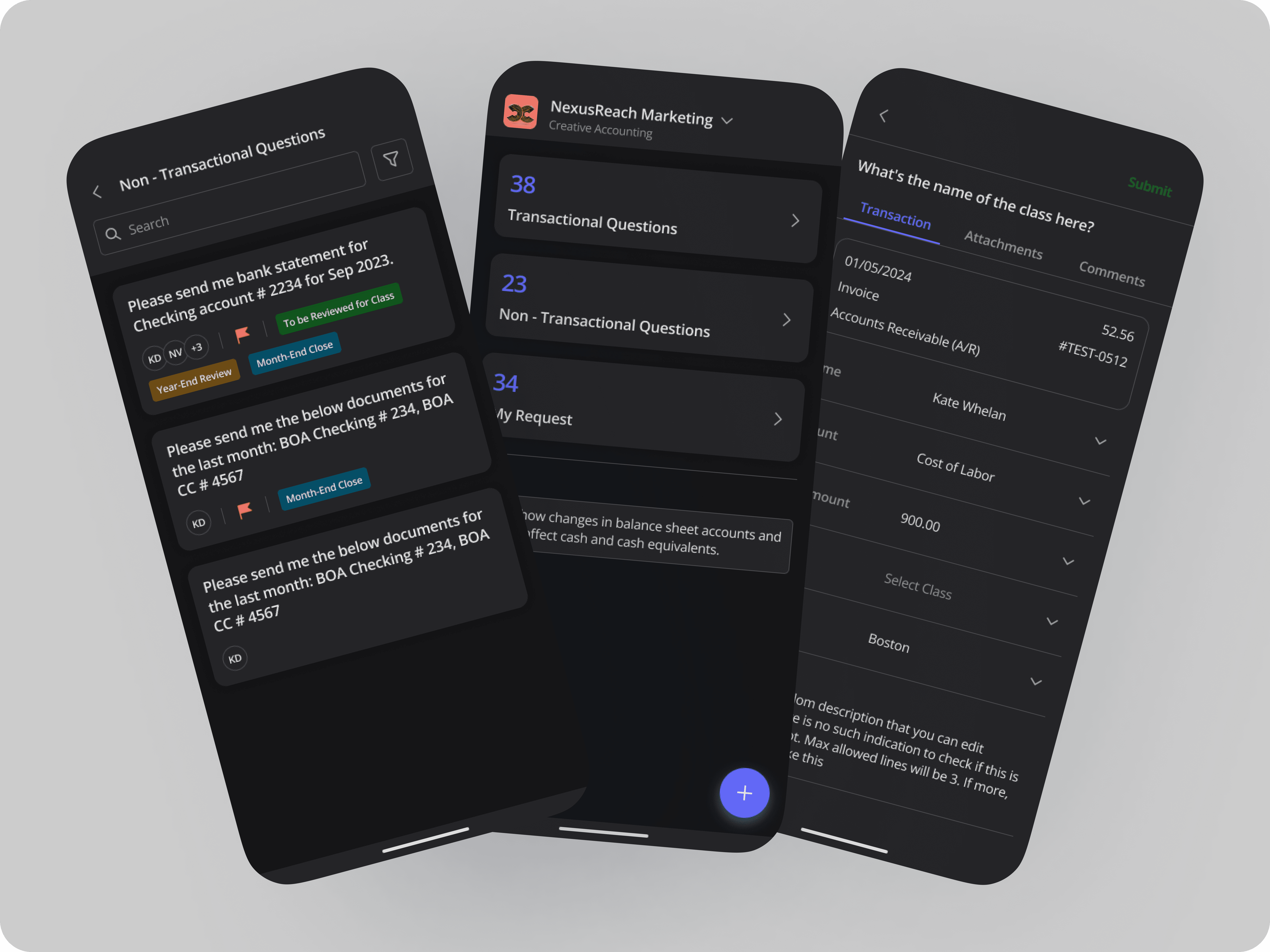
Typography contrast is carefully balanced to maintain readability
Icons and components stay consistent with the light mode experience
The overall interface feels calm, focused, and professional
Outcome & Impact
Faster client response times
Reduced dependency on emails and calls
Improved clarity in client-accountant communication
Better organization of documents and explanations
Key Learnings
Non-technical users need extremely clear language and layouts
Voice interaction can significantly reduce response friction
Structuring information improves trust and usability
Final Reflection
This project helped me strengthen my skills in designing communication-driven products for professional users. By focusing on clarity, speed, and flexibility, Client Connext delivers a practical solution that improves collaboration between clients and accounting teams.
Live App:
This app is available on the Google Play Store and is actively used by clients for day-to-day accounting communication.
-> View App on Google Play
