Project detail
Moniflo Revenue Platform
An all-in-one platform to track deals, payments, and commissions with complete clarity.
Web Design
1.5 Years
Moniflo

My Role
Product & UI/UX Designer
Scope: Dashboard · Clients · Deals · Payments · Commissions · Onboarding
Project Overview
Moniflo is a commission-first revenue management SaaS designed for high-ticket, deal-based sales businesses.
The platform brings together:
Deals & payment plans
Cash collected vs expected revenue
Missed & overdue payments
Commissions & bonuses
This product was designed in-house at Xenett for an external client.
I worked as a Product & UX Designer, owning the end-to-end UX across dashboards, clients, deals, payments, commissions, and onboarding.
The Problem
High-ticket sales companies struggle with:
Sales and finance working in silos
Manual tracking using spreadsheets
Missed payments identified too late
Frequent commission disputes
Clients lacking payment transparency
Core UX challenge:
How to make complex financial data simple, clear, and actionable for different user roles.
Users
Company Admin
Closer
Account Manager
Setter
Client
Referrer
Each role needs different information, so role-based UX was essential.
Solution
Moniflo was designed around:
Clarity over complexity
Action-first dashboards
Role-based visibility
Transparency to build trust
Minimal steps, maximum insight
Screens & UX Decisions
Login Screen
Purpose: Fast & secure access
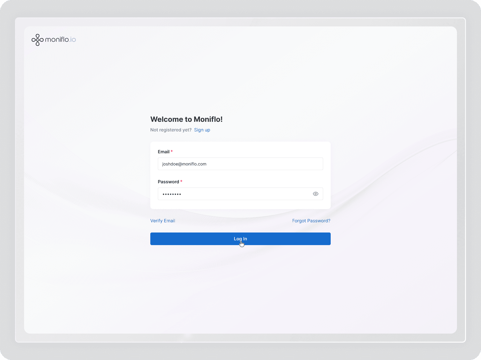
A clean and distraction-free login screen designed to help users quickly access their account.
The layout focuses on simplicity, trust, and ease of use, ensuring minimum friction for daily users of a finance product.
Signup Screen
Purpose: Easy account creation
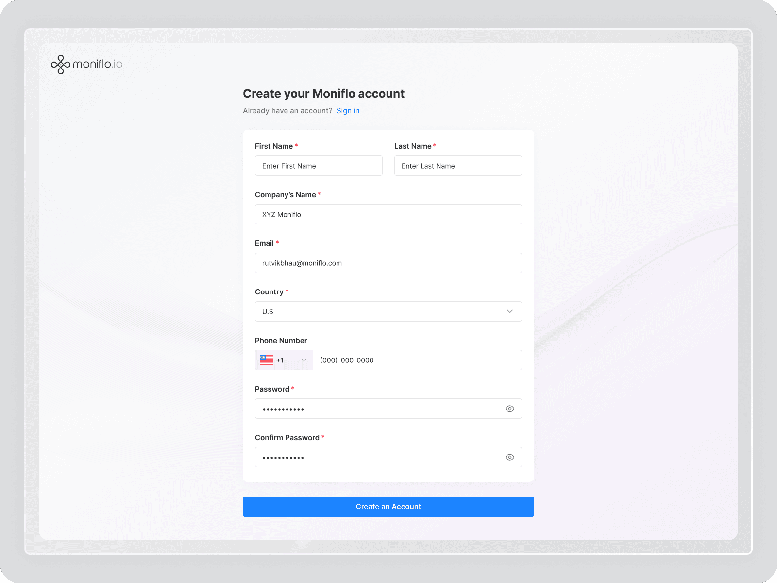
The signup flow is designed to onboard new companies smoothly with only essential information.
Clear form structure and simple inputs help users create an account quickly without confusion, while maintaining security and data accuracy.
Dashboard (Main Screen)
Purpose: Financial overview & daily action
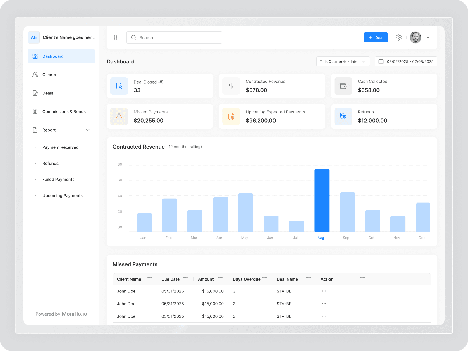
Key metrics: Deals, Contracted Revenue, Cash Collected
Risk indicators: Missed Payments, Refunds
12-month revenue trend for forecasting
Missed payments table for quick follow-ups
Clients List
Purpose: Manage clients at scale
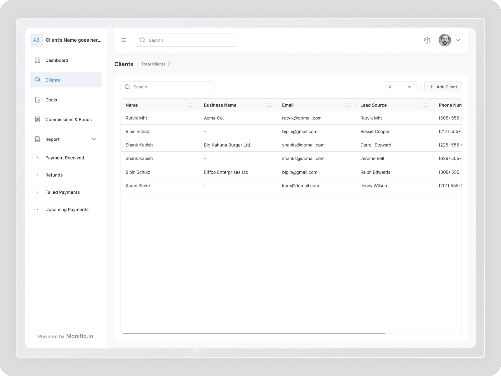
Clean table layout
Search & filters
Quick “Add Client” action
Client Details
Purpose: 360° client financial view

Client info & lead source
Financial summary (revenue, cash, dues)
Associated deals & payment plans
Deals List
Purpose: View and manage all deals in one place
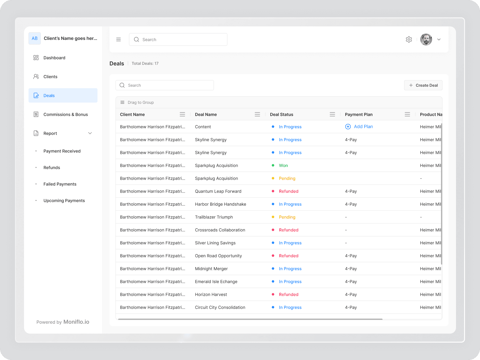
This screen provides a structured overview of all deals with their status, payment plan, and product details.
Color-coded deal statuses (In Progress, Won, Pending, Refunded) help users quickly understand deal health and progress.
The layout is optimized for fast scanning and easy management, allowing sales and account teams to track multiple deals efficiently.
Deal Details
Purpose: Complete financial view of a single deal
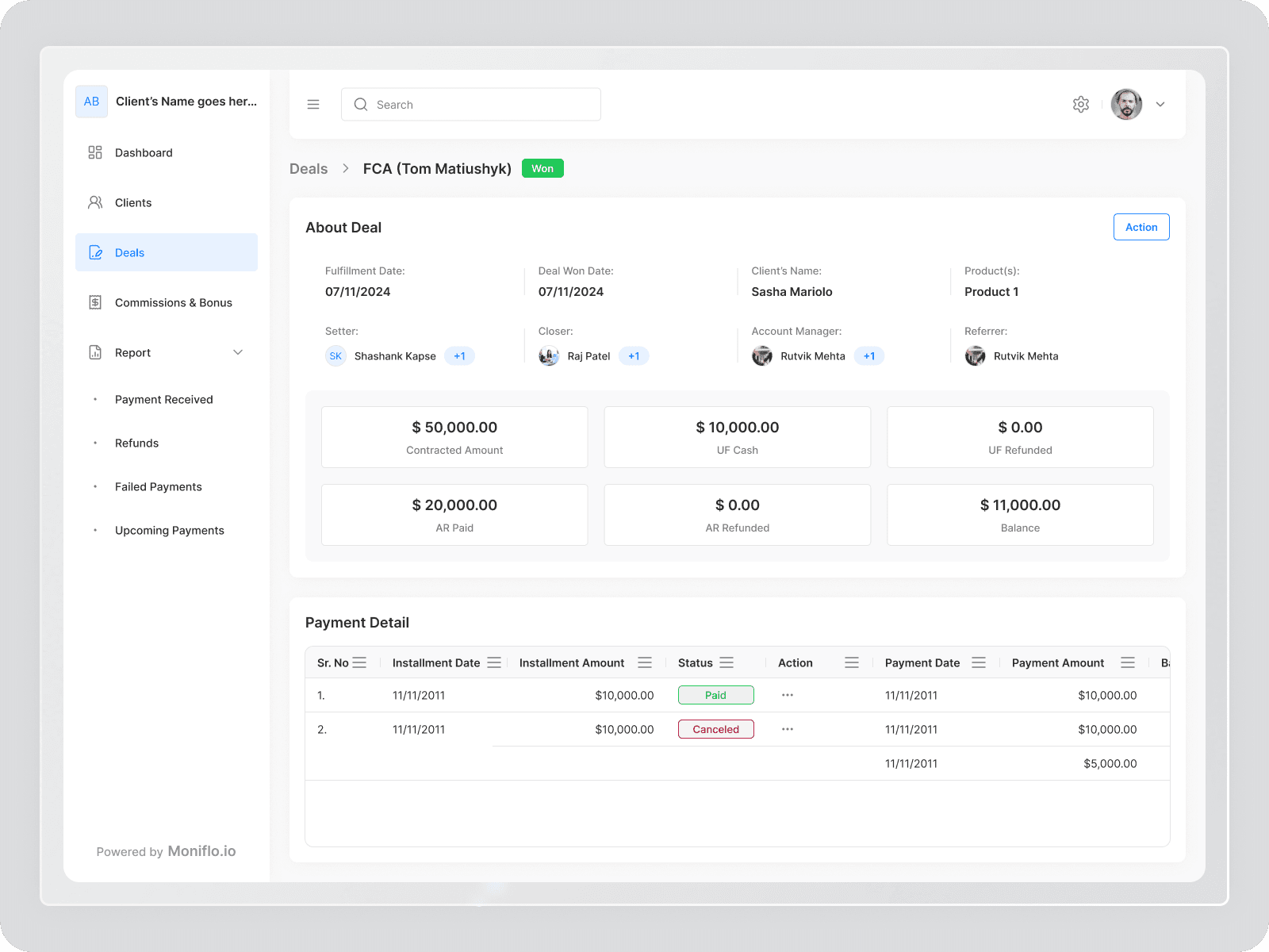
The deal details screen shows everything related to one deal in a clear and organized way.
It includes deal information, assigned roles (Setter, Closer, Account Manager, Referrer), contracted amount, cash received, refunds, and remaining balance.
A detailed payment table displays installments, payment status, and transaction history, helping teams track payments accurately and follow up when required.
Commissions & Bonus
Purpose: Trust and transparency for sales teams
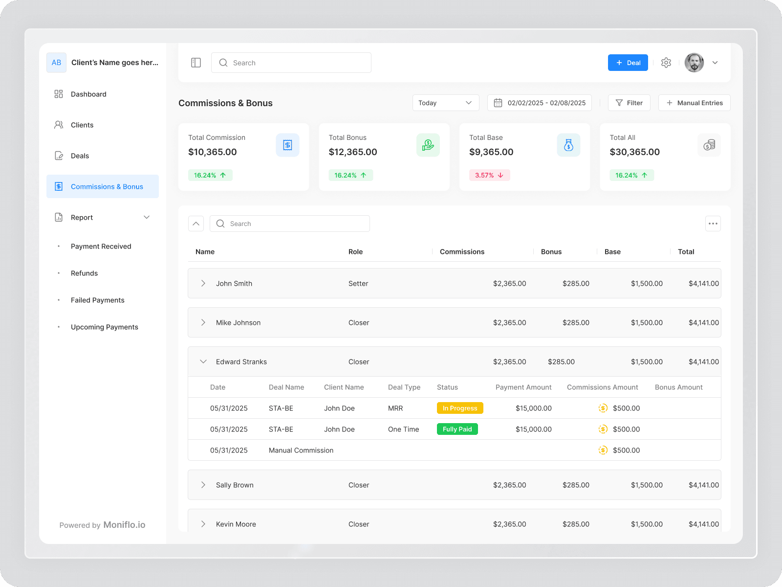
Clear breakdown: Base, Commission, Bonus, Total
Deal-level visibility
Status: In Progress / Fully Paid
Refunds Report Screen
Purpose: Track and understand refunds
This screen gives a quick view of refund activity across revenue types, helping teams identify revenue leakage and financial risk.
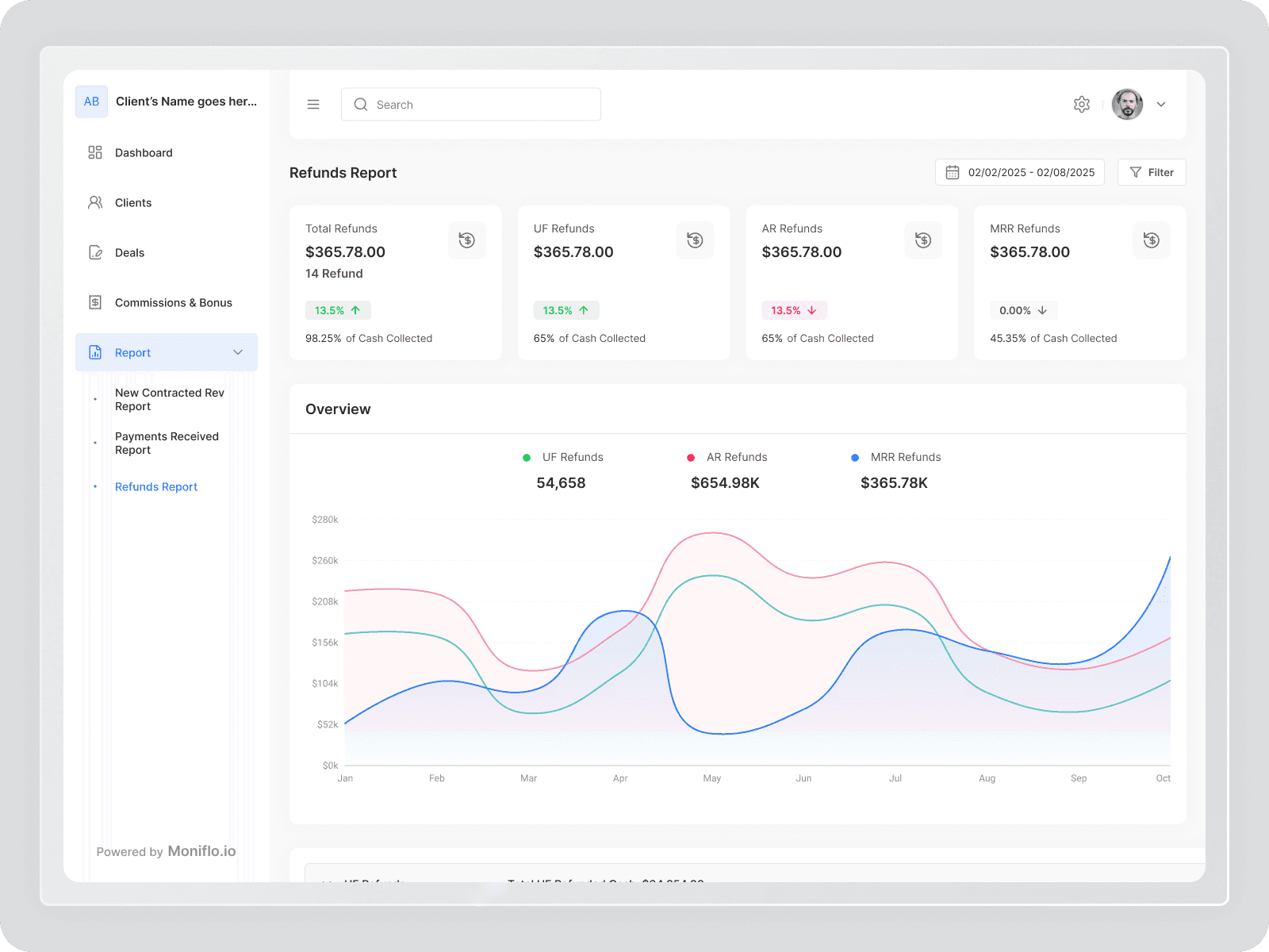
Key UX Elements
Summary Cards: Total, UF, AR, and MRR refunds with trends and % of cash collected
Date Range & Filters: Analyze refunds for any selected period
Refund Trend Chart: Visual comparison of refund types over time to spot patterns quickly
Visual Design
Clean SaaS layout
Finance-friendly color palette
Clear typography for numbers
Consistent spacing & components
White-label ready UI
Impact
Reduced manual tracking and errors
Faster identification of missed payments
Clear commission accountability
Better collaboration between sales & finance
Scalable system for growing sales teams
Key Learning
In financial products, clarity matters more than features.
